






Top hat tilted, coat tails caught mid-stride, cane in hand. Johnnie Walker’s Striding Man is one of the most recognisable figures in global drinks branding. You can spot him from across a bar, on an airport billboard, or embossed in gold on a bottle shelf.
But who is he, really?
Created in 1908 by British illustrator Tom Browne, the Striding Man has outlived world wars, redesigns, and entire advertising eras. He has evolved visually, shifted direction, and even been reimagined. Yet he has never stopped moving forward.
Quick whisky question
Single malt is everywhere, but what does it mean? We want to know what the word “single” means to you. Three quick questions, under a minute.
This is the story of how a simple sketch became the enduring symbol of Johnnie Walker, and why that forward motion still defines the brand today.
1908: The Birth of the Striding Man
The Striding Man was created in 1908, at a pivotal moment for Johnnie Walker.
By the early twentieth century, the business founded by John Walker had already established distinctive packaging. The square bottle reduced breakages in transit. The slanted label, trademarked in 1877 at a 24-degree angle, helped the bottle stand out on crowded shelves.
What Will Whisky Look Like in 2027? Voices from Whisky Live Paris
READ THE STORYThe icon came slightly later.
In 1908, cartoonist Tom Browne was commissioned to create a figure to represent the brand. According to multiple historical accounts, Browne sketched the first version during a lunch meeting with company directors. This story was even referenced by Diageo archivist Christine McCafferty on scotchwhisky.com. She does state, however, that Diageo does not have possession of the napkin…yet.
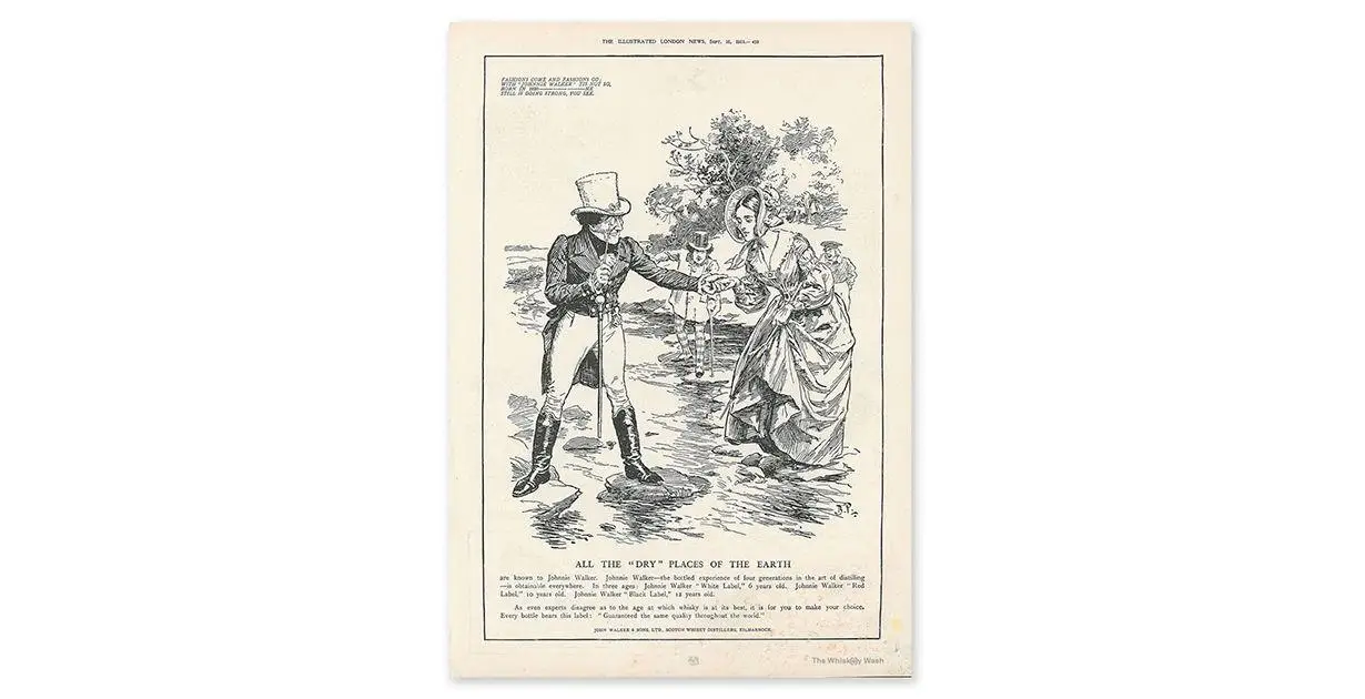
Following the sketch, the icon of the walking gentleman became the visual embodiment of a whisky brand that was, at the time, increasingly thinking internationally.
When the Striding Man was created, Johnnie Walker was under the stewardship of George and Alexander Walker II, the grandsons of John Walker.
Both men were increasingly focused on making Johnnie Walker a global brand. The Striding Man would ensure that the brand had an advertising symbol that would be recognised around the world.
Who Is the Striding Man Supposed to Be?
One of the reasons the Striding Man endures is that he is slightly ambiguous.
Some accounts suggest he was intended as a stylised representation of John Walker himself. Scotchwhisky.com notes that Tom Browne was enlisted to sketch the brand’s founder, reinforcing the link between icon and origin story.
Other historical commentary presents him less as a portrait and more as an archetype. In an interview reflecting on the brand’s bicentenary, Nicholas Morgan described the figure as a confident Georgian gentleman, created at a time when the company wanted to move beyond tartan clichés and signal something more cosmopolitan.
However, he also alluded to the idea that consumers might see the Striding Man and say “that’s Johnnie Walker!”. So, the mystery endures.
Why Movement Matters
Most heritage Scotch brands have logos and icons rooted in stillness and tradition. Crests. Stags. Heraldic shields.
The Striding Man is different because he moves.
From the beginning, he was shown mid-step. That sense of progress is not accidental. In its own corporate history, Diageo consistently frames Johnnie Walker around the idea of forward momentum and global expansion.
Movement signals ambition and purpose. It implies there is somewhere worth going.
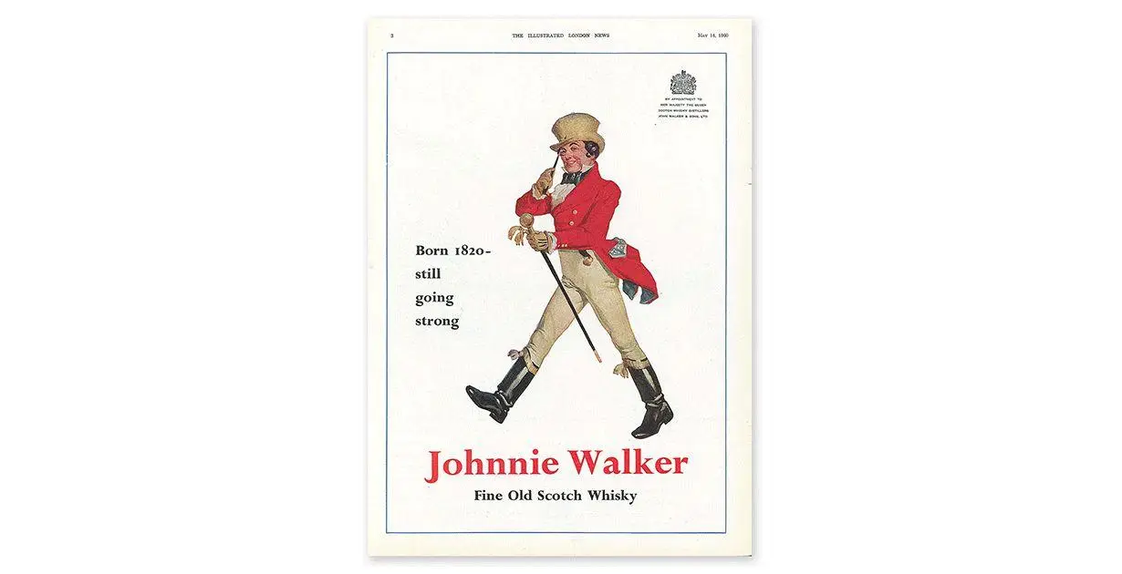
For a blended Scotch that built its success on export markets and international growth, a walking figure makes strategic sense. The icon did not just decorate the bottle. It communicated intent.
Long before the slogan “Keep Walking” existed, the brand had already designed a man who refused to stand still.
The Evolution of The Striding Man: Updating an Icon Without Breaking It
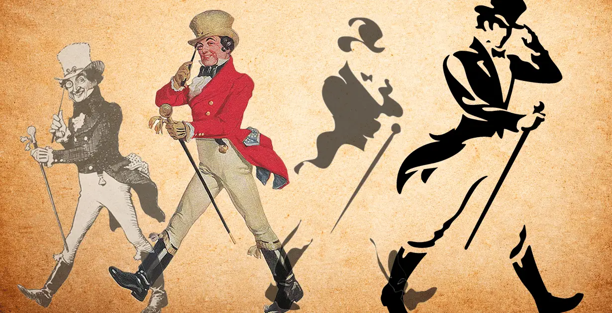
Since 1908, the figure has been redrawn several times, each update reflecting its era while preserving the core silhouette.
A notable early reinterpretation came in 1929 under illustrator Leo Cheney, who introduced a more refined, graphic version suited to modern advertising layouts.
A more strategic shift occurred in 1996, when design agency BBH helped modernise the figure for a new global era. Three years later, the Striding Man was turned to face right. In Western visual language, rightward motion signals forward direction and progress.
The most recent significant refinement came in 2015, led by illustrator Gary Redford in collaboration with Bloom. VinePair describes this modern Striding Man as “eschewing the delicacy of yore for a more playful, countryside manner.”
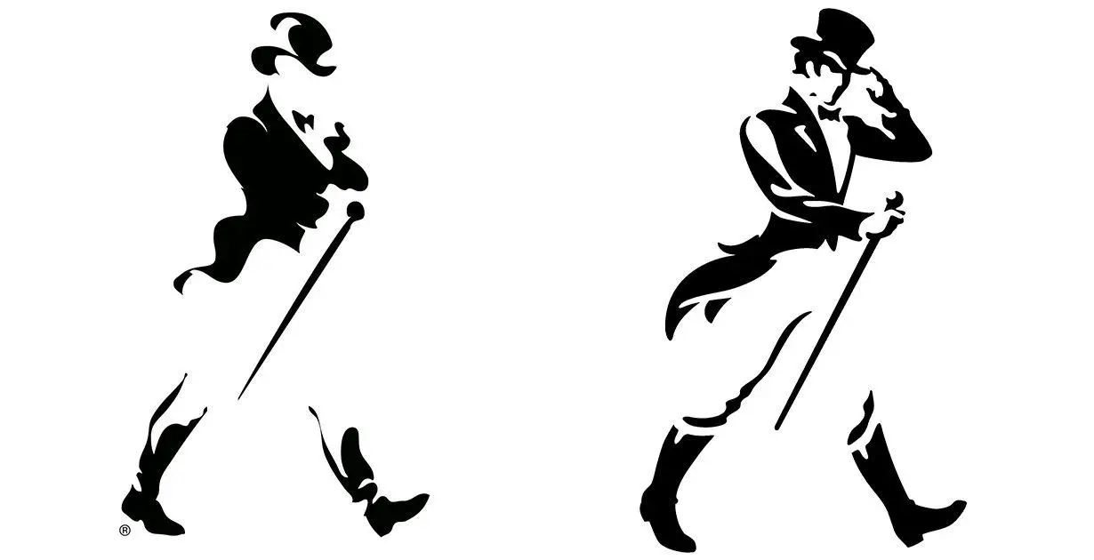
Each redesign followed the same principle. Modernise the detail, and preserve the stride.
1999: When “Keep Walking” Changed Everything
For most of the twentieth century, the Striding Man was a powerful visual device.
But in 1999, the same year that he changed direction on the bottle, Johnnie Walker decided to give the Striding Man a slogan that would back up his dynamic movement.
So, Diageo and BBH launched the global “Keep Walking” platform for Johnnie Walker, reframing the brand around progress and personal journey.
The Institute of Practitioners in Advertising case study documents the scale and impact of the strategy, noting rollout across more than 120 markets and significant long term growth following launch. They also noted that from 1999 to 2008, total sales grew by 48%.
In an interview reflecting on the campaign, BBH co-founder John Hegarty explained that the breakthrough was to define success as a journey rather than a destination.
That insight aligned perfectly with the icon. The Striding Man had always been walking, and “Keep Walking” gave that movement meaning.
Cultural Impact, Reinvention, and Debate
Once “Keep Walking” reframed the Striding Man as a symbol of progress, he became more than a logo. He became cultural shorthand.
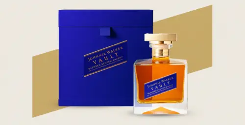
The brand has repeatedly revisited the icon to mark milestones. In 2016, Johnnie Walker released a Blue Label “Striding Man Edition” featuring four historic versions of the figure from 1908 to 2015, effectively turning logo evolution into a collectible narrative.
Reinterpretation has also extended beyond nostalgia. In 2018, the brand introduced Jane Walker, described by Diageo as the first female iteration of the Striding Man, created to mark International Women’s Day.
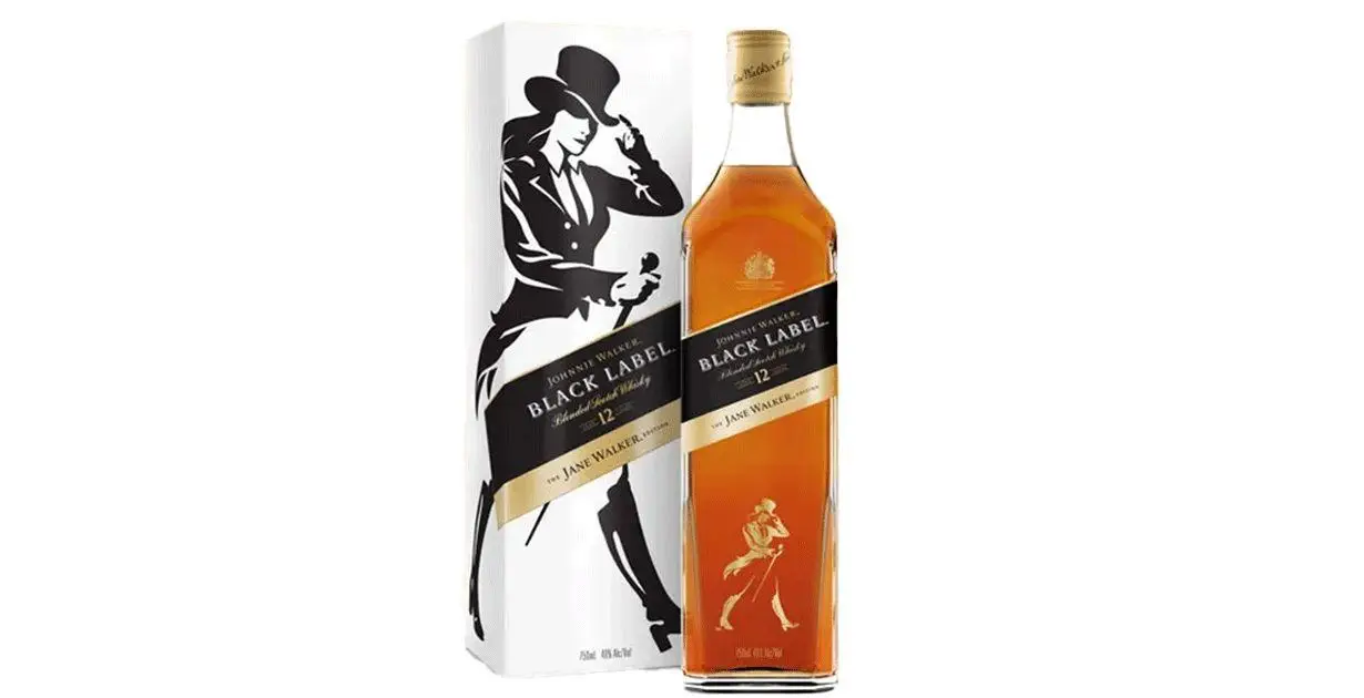
The move generated significant media coverage and debate, with many arguing that the campaign was patronizing to women.
That discussion underlined something important. An icon that has endured for more than a century carries cultural weight. Any reinterpretation will invite scrutiny.
But what all of these reinventions show is that the Striding Man is not just about static heritage. He reflects changing ideas about identity, ambition, and progress. Perhaps we will see another reinvention of him in the future.
Real-World Resonance With Whisky Drinkers
For all its heritage and advertising muscle, the real test of the Striding Man is not in an archive or on a billboard, but at the bar. Today’s whisky drinker is often drawn to small batch releases, independent bottlers, and local distilleries where the narrative feels intimate and personal.
In that landscape, a century-old global icon could easily feel corporate or distant. And yet it rarely does.
Walk into almost any bar around the world and the silhouette is still instantly recognisable.
When you want a familiar dram rather than something explorative, the Striding Man is still there, tipping his hat at you, inviting you to pour a glass of Black Label.
Black Label is consistently praised for its balance and warming notes of vanilla, toffee, citrus, and peppery spice, which is enveloped neatly in gentle smoke. I drink Black Label when I want something easy, comforting, and reliable. The whisky inside Johnnie Walker’s bottles is designed for consistency, which is mirrored in the presence of the Striding Man.
You may not choose Johnnie Walker because of the Striding Man alone, but his presence still communicates something reassuring. In an industry built in part on brand storytelling, he remains a durable character.
Why the Striding Man Still Works
More than a century after his creation, the Striding Man remains central to Johnnie Walker.
The core silhouette has never fundamentally changed. He still walks forward. The surrounding design language has evolved, but the action remains constant.
Diageo Global Brand Director, Julie Brabham, frames the brand around progress and global reach, reinforcing that the Striding Man is not decorative but conceptual: “The Spirit of Progress is at the heart of Johnnie Walker – from the icon of the Striding Man, to the message Keep Walking. Our brand icon is in motion, full of momentum and leading the way.”
In a category that often leans on stillness, nostalgia, or sometimes slap-you-in-the-face novelty, forward motion still feels distinctive and helps keep Johnnie Walker in the limelight all these years later.
 Latest On The Whiskey Wash