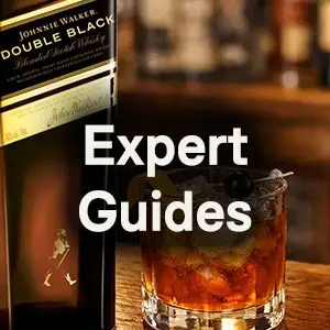




If you’ve spent any time around a bar or a liquor store, you’ve probably noticed Johnnie Walker without really trying, thanks to its square bottle and the label running across the front at an angle. Both were part of the brand in the 19th century, long before the Striding Man came along in 1908.
Over the years, plenty of explanations have done the rounds for why the bottle and label look the way they do, including the popular theory about the 24-degree angle. Dr. Nicholas Morgan’s history of the company, Johnnie Walker: A Long Stride, adds a few details that rarely come up, including a court case and a disagreement within the Walker family.
So, let’s take a look at where the square bottle and slanted label came from, and why they’ve stuck around for so long.
What Will Whisky Look Like in 2027? Voices from Whisky Live Paris
READ THE STORYJohnnie Walker’s Slanted Label
Pick up a bottle of Red Label or Black Label today and you’ll see the label running across the front at an angle, which is one of the things that makes Johnnie Walker so easy to spot on a crowded shelf. The angle goes all the way back to Alexander’s Old Highland Whisky, which Morgan says was sold with a small white label with gold lettering, set at an angle on the bottle.

Alexander went to the trouble of protecting the design, registering the copyright of the label at Stationers’ Hall in London in 1874. The labels were designed by Smith Brothers of Kilmarnock, and by 1881 the slant was being described at the Court of Session in Edinburgh, where the bottle was said to have “the label affixed to it in an oblique or slanting way near the middle of the bottle.” Even the words “John Walker & Sons” on the metal capsule ran “in a slanting or oblique direction.”
As for why Alexander tilted the label in the first place, there are a few different explanations, and some have become much better known than others.
 Trending Content



Johnnie Walker’s Square Bottle
The square bottle has been part of Johnnie Walker’s look for almost as long as the slanted label. According to Morgan, Walker’s were probably using square bottles in some markets from the time the label was introduced in the 1860s, and they first appear in the company’s London stock records in 1874. The early square bottles even had “Kilmarnock Whisky” embossed on the punt, the indent in the base of the bottle.
Square bottles weren’t a new idea at the time, since they were widely used for patent medicines, table sauces, and gin. Morgan explains that they were unusual for Scotch, though, and highly distinctive “in a sea of round bottles.”
When White, Red, and Black Label launched in 1906, Morgan writes that each one came in “Walker’s trademark square bottle.” Why the company chose the shape is another question with more than one answer, and not everyone in the business was convinced it was a good idea.
The Popular Theories
The best-known explanation for the label is that it sits at exactly 24 degrees. The idea is that tilting the label across the front of a square bottle gives it a longer run than it would have sitting straight, which leaves more room for larger lettering. Mark Littler worked through the math behind this in The Real Reason Johnnie Walker’s Label Is Always At 24 Degrees.
The square bottle has a popular story of its own, which is that the shape cut down on breakages and let Walker’s fit more bottles into each case.
Morgan gives his own reasons for both. He describes the slant as “designed to capture the eye’s attention,” and writes that square bottles were “relatively expensive to produce but in turn provided packaging optimisation during shipping and may have offered some savings in freight costs.” In The Complete Whiskey Course, Robin Robinson writes that the angled label on a square bottle “was a sure sign that something different was going on inside, even if it was originally intended for more practical purposes.”
However, the square bottle also caused some trouble inside the company.
A Family Disagreement Over the Square Bottle
Morgan writes that Walker’s used both square and round bottles for Old Highland at first, and the company’s business letters suggest it was the London office that pushed for the square one. Alexander had his doubts, mainly because square bottles were sent back to Walker’s to be reused.
He complained about “all the trouble of returned empty, half-broken, cases, broken bottles, and perhaps only half the number in each.” Round bottles were thought to appear more to customers, since, as the correspondence put it, “the wine merchant will try and buy whisky in bottles he can conveniently use for other purposes.”
Alexander’s son George summed up his father’s position in a letter: “Father… is altogether averse to this style of package & in the meantime won’t entertain the idea at all.”
The square bottle stayed, and Morgan’s view is that it was “more than worth the trouble it may have caused.”
Why the Bottle and Label Stuck Around
I’d argue Johnnie Walker has some of the most recognizable packaging in the drinks world, not just in Scotch. You can pick out the square bottle and slanted label from across a bar without reading a word on it, and the design has held its place for more than 150 years, even as the whisky inside has picked up new colors, names, and age statements.
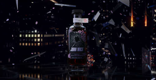
The company has made good use of that recognition in its advertising over the years, and by the 1950s it was promoting Johnnie Walker as “the smooth round whisky in the square bottle.” You can see plenty of examples of the bottle and label at work in our Johnnie Walker Advert Archive, which has more than 100 of the brand’s older adverts.

Still Square, Still Slanted
Whether you put it down to the 24-degree math, fewer breakages, savings on shipping, or a simple wish to stand out on the shelf, Johnnie Walker’s square bottle and slanted label have outlasted a great deal of change at the company, including a family disagreement over whether the bottle was worth the trouble. If you’d like the full story, Nicholas Morgan’s Johnnie Walker: A Long Stride is well worth reading.
Which of the explanations do you find most convincing?